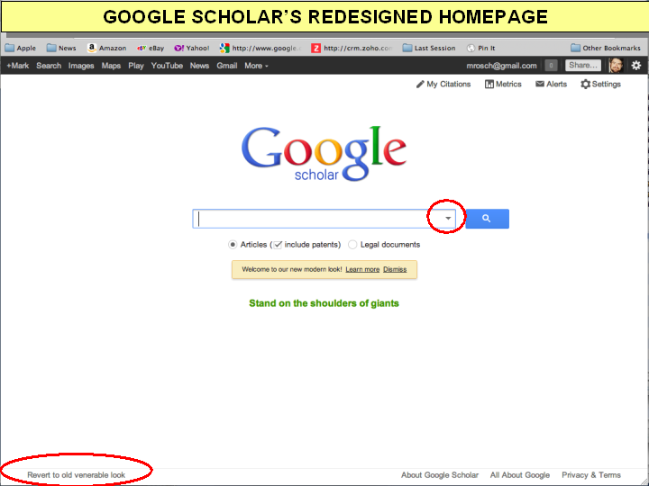
Google appears to be testing out a redesign to its Google Scholar interface that integrates the service’s Advanced Search page into a drop-down menu to the right of the search box. Google labels it “our new modern look,” while we label it a major hindrance to those using Google Scholar to conduct case law research. It’s a hindrance for two reasons:
- it’s hidden (see Illustrations 1 and 2) and
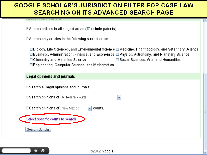
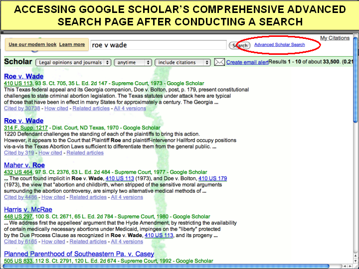
- it no longer allows you to “Select specific courts” as you used to be able to (see Illustrations 3 and 4). Instead, Google forces you into a time consuming two-step process where you first run a search and then after viewing your results, which include every state and federal court, you are allowed to narrow down to the court(s) you wanted to search in the first place (see illustration 5).
See the end of this article for two options to work around this new redesign.

Illustration1

Illustration 2

Illustration 3

Illustration 4
Luckily, there are still a few different ways to access the old (better/more comprehensive) version of the Google Scholar Advanced Search page.
The first is via the direct URL - http://scholar.google.com/advanced_scholar_search?hl=en&as_sdt=0,32.
The second is to look for the link at the lower-left bottom of the homepage labeled "Revert to old venerable look" and click it. (See illustration 1.) This will display the old version of the Google Scholar search page, complete with a link to the more comprehensive Advanced Search page.
The third is to conduct a search via the new interface and look for the Advanced Scholar Search link to the right of the search box at the top of the search results page. (See illustration 5.)

Illustration 5
| Attachment | Size |
|---|---|
| GOOGLE_SCHOLAR_DROPDOWN ADV.png | 84.7 KB |
| GOOGLE_SCHOLAR_HOME_PAGE.png | 68.82 KB |
| GOOGLE_SCHOLAR_JURISDICTIONS.png | 170.32 KB |
| GOOGLE_SCHOLAR-ADVANCED_SEARCH_AFTER.png | 284.95 KB |
| GOOGLE-SCHOLAR-ACCESS-JURISDICTIONS.png | 70.52 KB |
| GOOGLE_SCHOLAR_DROPDOWN_ADV.png | 84.7 KB |
THE LATEST INTERNET RESEARCH TIPS
Read the latest strategies, tips and new resources available for integrating the Internet into your law practice in our newsletter.
-
09/04/2016
-
09/04/2016
-
09/04/2016
